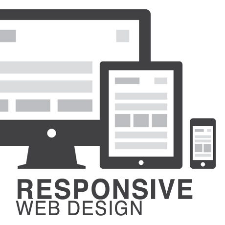
Responsive Web Design (RWD) vs Adaptive Web Design (AWD)

We’ve heard the terms Fluid, Adaptive, and Responsive used interchangeably when describing a theme’s ability to resize according to browser specs or device (mobile or not) size. Are they really different from one another or are they referring to the same characteristics found in themes described as such?

What is Responsive Web Design (RWD)? Responsive Layout?

Let’s take a closer look.

Responsive web design (often abbreviated to RWD) is an approach to web design in which a site is crafted to provide an optimal viewing experience—easy reading and navigation with a minimum of resizing, panning, and scrolling—across a wide range of devices (from desktop computer monitors to mobile phones) – Wikipedia

Responsive design is the methodology behind making a website respond to whatever platform you are viewing it on regardless of resolution and orientation. It may change how certain elements display but it will not remove elements or change the core functionality of their behaviours. Responsive design uses a fluid grid and it is usually possible entirely through HTML and CSS, without the need for DOM (Document Object Model) manipulation. – Matthew Freeman

According to Ethan Marcotte, The 3 Elements of Responsive Web Design are:

A flexible, grid-based layout – A layout based on proportions rather than absolutes; uses a flexible grid, which in turn ensures that a website can scale to a browser’s full width.

Flexible images and media – Layouts based on percentages resize gracefully according to the size of the browser window rendering them. However, it is problematic to ensure that the content within a site resizes.
Images and media should scale with the flexible grid; images that work in a flexible context, whether fluid themselves or perhaps controlled through overflow mechanisms. CSS addresses this problem with its max-width property

Media queries – Content based breakpoints; optimize the design for different viewing contexts and spot-fix bugs that occur at different resolution ranges. CSS3’s media queries directly address these usability problems by allowing browsers to serve different styles for different viewing contexts. CSS3 greatly expands support for media queries, adding the ability to target media features such as screen and device width and orientation.

These 3 elements of Responsive Web Design find their way into 3 different types of Responsive (RWD) Layouts:

The Basic Fluid Lay­out
Con­tent con­tin­u­ally flows or adjusts in a word-wrap fash­ion as screen width is increased or reduced. There are no “dis­tinct” dif­fer­ences in con­tent pre­sen­ta­tion. Fluid layouts are dynamic and user sensitive – adapting to the available real estate on the user interface and providing increased content accessibility.

The Adap­tive Lay­out
There are pre­de­fined sizes were dif­fer­ent lay­outs are trig­gered. These are called breakpoints. Typ­i­cally there are three or four break­points to accom­mo­date desk­top, tablet and mobile screen sizes.

The Respon­sive Lay­out
This is a hybrid of Basic Fluid Lay­out and Adap­tive Lay­out. There are pre­de­fined break points, how­ever in between these breakpoints con­tent will flow to expand or con­tract.

According to his article for the Adobe Blog, Carl Sandquist states that:

“Cur­rently, most RWD web sites use Respon­sive Lay­out since it offers a best-of-both-world expe­ri­ence. Con­tent snaps into the appro­pri­ate approx­i­mate posi­tion for a device type (e.g. Tablet) and then fine-tuned adjust­ments are made for the exact screen size on a par­tic­u­lar device.”

What is Adaptive Design (AWD)? Adaptive Layout?

“Adaptive design is the manipulation of layouts to best perform on certain screen resolutions inclusive of elemental removal or behaviour changing techniques. Adaptive design usually requires Javascript to efficiently manipulate the DOM. Javascript can be avoided if you plan on having duplicate on-page elements and then show or hide them based on screen sizes, this might be appropriate for smaller elements but not whole columns or navigation elements.” – Matthew Freeman

“This technique adapts what is displayed depending on the capabilities of the device being used, as well as the screen size. It centres on the context of the user, so even when the same content is used, it is adapted (with some or even all of the design elements changing), depending on whether the user is using a mouse and keyboard or touch screen. AWD also uses different layouts for tablets and mobiles with certain. ‘Responsive’ elements built in to reduce the number of different templates required. AWD can be taken to further extremes with content being completely repackaged and reworded, while images and video are either reworked or completely removed.” – Danny Bluestone

According to Aaron Gustafson, author of Adaptive Web Design, Crafting Rich Experiences with Progressive Enhancement:

“Progressive enhancement isn’t about browsers. It’s about crafting experiences that serve your users by giving them access to content without technological restrictions. Progressive enhancement doesn’t require that you provide the same experience in different browsers, nor does it preclude you from using the latest and greatest technologies; it simply asks that you honor your content (and your users) by applying technologies in an intelligent way, layer-upon-layer, to craft an amazing experience.

He encourages designers to: Think of the user, not the browser.”

Which one is better?

A better understanding of the differences between Responsive Web Design and Adaptive Web Design is a starting point to deciding which solution will work well for you, or your clients, if you are a WordPress professional. Knowing what solutions are available and having the ability to distinguish and implement whichever design approach best meets the specifications of the end user is an important element. Of course, nothing is carved in stone. Future designs may be a combination or a hybrid of both – employing the best features of each one. The goal is to ensure that the user experience at the point of searching and eventually finding your website is the best experience they get at that particular moment – fully hoping that it will be the first of many more visits and not their last.


Elegant Themes Shortcodes: Now Responsive!

With the advent of mobile platforms, WordPress themes have to adapt to the demands of this steadily growing user base. It can really be quite frustrating to read articles from any major newspaper’s website on iPhone or Android and get all the content mish mashed. Theme developers and web designers need to move more and more toward this emerging trend towards responsive themes.

It is a welcome development that Elegant Themes recently released its responsive shortcodes. While Elegant Themes has been churning out responsive themes for quite a while, the shortcodes were left out. It took 10 responsive themes before mobile friendly shortcodes were released. Great news, indeed!

So how do these new shortcodes, improve mobile browsing experience? Elegant Themes’ blog cites two examples of their improvement strategy. Tabs have always been an issue when websites typically viewed on a 960px wide screen to a 320px width. No matter what you do, having 10 tabs will alway come out cramped. Solution: Tabs turn into a slider when switching to mobile mode. It just makes sense to have sliders rather than have unreadable tab labels. Another example cited was the case of columns. As the content width gets narrower, text in columns become a bunch of flying letters. Solution: the new shortcodes convert columns into boxes when switching to mobile screens. Brilliant isn’t it? Regarding the new shortcodes, Elegant Themes has declared them to be fluid width giving them the capacity to shrink and expand according to screen size.

Web design and the emerging technology innovation and trends are accelerating even faster. More and more mobile users prefer to access the web through their devices and WordPress Themes providers need to step up their game. For loyal subscribers of Elegant Themes, these concrete steps towards updating and upgrading all Elegant Themes products is always welcome and appreciated.

Congratulations to Elegant Themes for taking WordPress theme development one step further and fully embracing the future of WordPress.

See Elegant Themes’ Responsive Shortcodes

Nick Roach’s Elegant Themes Review

Elegant Themes - Updated Review for 2014

Updated: April 12, 2021 – 2021 is nearing the middle of the year, and now is a good time to update one of our most popular articles here on Blogging Experiment. For several years we have been singing the praises of Elegant Themes, and 2014 is shaping up to be no different. In a day and age where companies and websites come and go, Elegant Themes has not only stood the test of time, they have continued to innovate by creating massive value for their over 250,000 customers! In the following article, we’d like to give you a detailed overview of just why we call Elegant Themes the Best Deal in WordPress!

After all, having the right WordPress Theme is crucial to your websites’ success. It’s kind of like the study that showed how people looking to buy a home can make up their mind within 8 seconds of walking in the door whether they like it or not – by not giving your visitors the right first impression (your design) – you’re literally inviting them to hit the back button.

The Dilemma

As a blogger your focus should be on content. Blog design is important, but when you think about it, do people go to Craigslist because it looks pretty? Absolutely not. They use it because they’re the best in the field.

Since we’re not all Craigslists, we must merge the design and content aspects together in as seamless a manner as possible. You want to have a nice looking design, but you most likely are not strong in design itself (much less coding that pretty design). You want a unique, impressive look that conveys professionalism and passion about your craft, but you’re probably not an expert at usability (how “usuable” your site is to visitors). And finally, you want to do all this in the cheapest, most cost effictive way possible (nothing wrong with that).

Elegant Themes

Have you ever spent any length of time browsing around countless free wordpress theme sites only to be left feeling unsatisfied? Does it seem like most of the free themes are … well … free for a reason? Where are all the best wordpress themes? After going through these motions for a period of time, I decided to take a look at some premium wordpress themes to see if they were really that much better than the free ones. Shortly thereafter, I discovered Nick Roach’s Elegant Themes, and that changed everything for me.

I knew I could hire a web designer to create a nice looking website as I’ve done countless times in the past. But at $800 to $3500/pop, designers can be expensive. I was interested in finding a nice looking design that I could learn to tweak and modify myself to make it more personalized and customized to my liking.

As a website and blog developer, I am frequently developing new sites, and aside from the content itself, I want each design to be unique and professional. Enter ElegantThemes.

Elegant Themes Premium WordPress Theme Club

Forget $200 to $500 like many other premium theme clubs, for $69…YES, $69 – members get unlimited access and unlimited use to all of Nicks’ premium WordPress Themes. To date there are 80+ elegant WordPress Themes.

I’m going to get out of the way and let Nick’s design speak for itself. As you will see, these are top notch designs that would normally run you several thousand dollars a piece (I’ve researched hiring a good WordPress theme designer, and that is the going rate – typically the floor of their going rate).

Without further ado, here are some of the premium WordPress themes from Elegant Themes:


Nexus WordPress Theme

Blogex image_nexus

Nexus Features:

  • Magazine style
  • Responsive design
  • Unlimited color schemes
  • Secure and valid code
  • Complete localization
  • Browser compatibility
  • Perpetual updates
  • Unparalleled support
  • ADVANCED: ePanel theme options
  • ADVANCED: shortcode collection
  • ADVANCED: page templates

Example Site(s) using the Nexus Theme (Showcase):

More Information On Nexus From Elegant Themes:

Demo Nexus


Vertex WordPress Theme

Blogex image_vertex

Vertex Features:

  • Responsive design
  • Unlimited color schemes
  • Secure and valid code
  • Complete localization
  • Browser compatibility
  • Perpetual updates
  • Unparalleled support
  • ADVANCED: ePanel theme options
  • ADVANCED: shortcode collection
  • ADVANCED: page templates

Example Site(s) using the Vertex Theme (Showcase):

  • Email us if you are using the Vertex Theme, and we’ll list you here.

More Information On Vertex From Elegant Themes:

Demo Vertex


Fable WordPress Theme

Blogex image_fable

Fable Features:

  • Responsive design
  • Unlimited color schemes
  • Secure and valid code
  • Complete localization
  • Browser compatibility
  • Perpetual updates
  • Unparalleled support
  • ADVANCED: ePanel theme options
  • ADVANCED: shortcode collection
  • ADVANCED: page templates

Example Site(s) using the Fable Theme (Showcase):

  • Email us if you are using the Fable Theme, and we’ll list you here.

More Information On Fable From Elegant Themes:

Demo Fable


Foxy WordPress Theme

Blogex image_foxy

Foxy Features:

  • eCommerce
  • Responsive design
  • Unlimited color schemes
  • Secure and valid code
  • Complete localization
  • Browser compatibility
  • Perpetual updates
  • Unparalleled support
  • ADVANCED: ePanel theme options
  • ADVANCED: shortcode collection
  • ADVANCED: page templates

Example Site(s) using the Foxy Theme (Showcase):

  • Email us if you are using the Foxy Theme, and we’ll list you here.

More Information On Foxy From Elegant Themes:

Demo Foxy


Explorable WordPress Theme

Blogex image_explorable

Explorable Features:

  • Location based directory
  • Responsive design
  • Unlimited color schemes
  • Secure and valid code
  • Complete localization
  • Browser compatibility
  • Perpetual updates
  • Unparalleled support
  • ADVANCED: ePanel theme options
  • ADVANCED: shortcode collection
  • ADVANCED: page templates

Example Site(s) using the Explorable Theme (Showcase):

  • Email us if you are using the Explorable Theme, and we’ll list you here.

More Information On Explorable From Elegant Themes:

Demo Explorable


StyleShop WordPress Theme

Blogex image_styleshop

StyleShop Features:

  • eCommerce
  • Responsive design
  • Unlimited color schemes
  • Secure and valid code
  • Complete localization
  • Browser compatibility
  • Perpetual updates
  • Unparalleled support
  • ADVANCED: ePanel theme options
  • ADVANCED: shortcode collection
  • ADVANCED: page templates

Example Site(s) using the StyleShop Theme (Showcase):

  • Email us if you are using the StyleShop Theme, and we’ll list you here.

More Information On StyleShop From Elegant Themes:

Demo StyleShop


Fusion WordPress Theme

Fusion Theme from ElegantThemes.com

Fusion Features:

  • Responsive design
  • Unlimited color schemes
  • Secure and valid code
  • Complete localization
  • Browser compatibility
  • Perpetual updates
  • Unparalleled support
  • ADVANCED: ePanel theme options
  • ADVANCED: shortcode collection
  • ADVANCED: page templates

Example Site(s) using the Fusion Theme (Showcase):

  • Email us if you are using the Fusion Theme, and we’ll list you here.

More Information On Fusion From Elegant Themes:

(more…)


WordPress Design For A Global Market

Design is subjective. There are generally accepted design principles that govern the design community and serve as guides to evaluating “correct” design. However, not all of them are totally applicable to specific clients especially when Western taste buds meet Eastern culture. But when and where shall the ‘twain ever meet if beauty and design aesthetics are wrapped deeply in mores and culture?

This is the cross cultural challenge that web designers need to face in order to remain competitive in today’s global market place.

West, Meet East

Before the West was, the East was. Two of the world’s oldest civilizations, China and India, are also two of the fastest and most robust economies today. According to Census.gov, as of 2014, China and India ranked as the top two countries with the highest population in the world. China ranked first with 1.3B (population) with an approximate 42.3% Internet penetration, followed by India with 1.2B (population) with an approximate 81% Internet penetration. Approximately 1 billion internet users from these 2 (right to left, top-to-bottom reading) countries alone. And if theme developers do the math, even if at 1% of a billion internet users, that’s still a lot of WordPress themes right there. Too many to ignore.

Global Market Local User Design

We’ve talked about defining your target market and directing your business to reaching your specific demographic. Once you have that down pat, it’s probably time to think of expansion and consider widening your net a little further. To go a little more granular and target the local user.

With WordPress powering over 21% of the Internet and being one of the most user friendly and reliable CMS systems existing today, aside from the fact that it is free, more and more Internet users are looking to it as their platform of choice.

With that, the popularity of WordPress has crossed over into multi language markets despite having been around for only a decade and catering mainly to users of modern languages which are generally left to right in direction. Hence, the increase in demand for WordPress themes with RTL or WPML features or WP plugins that provide this functionality.

The diversity of WordPress users from all across the globe is becoming an important factor in developing themes that are relevant culturally and technically suited to these users local needs. As responsive once was a premium feature that has now become a standard feature in all WordPress themes, so shall the multi language and RTL feature become.

The Design Approach

The WordPress theme development marketplace has grown considerably with designers coming up with better and more user friendly designs that match the general needs of WordPress users. There is a huge pool of WordPress themes available for, generally, almost every type of website need out there. But there is still room to grow for more cross-cultural friendly options.

Below are some design elements that designers need to consider when creating themes that are responsive to culturally diverse user groups. (Notes culled from W3.org and Sitepoint.com)

  • Language
    – Languages don’t have a direction. Scripts have a writing direction, and so languages written in a particular script, will be written with the direction of that script. Languages can be written in more than one script.
  • Typography – fonts and characters
    – Typography can look “busier” to Western eyes than to Asian readers because many Asian scripts don’t have separate upper and lower cases. Some languages have scripts that are not alphabetic at all, but which express an idea rather than a sound. Occasionally, it’s necessary for an author to provide readers with pronunciation help for especially rare or awkward characters, usually with an alternative script in small writing above the ambiguous character.
  • Content presentation
  • Styling
  • Usability
  • Navigation
  • Mirror layout
  • Scripts (Left to Right, Right to Left, Top to Bottom)
    – Text direction is another thing that should not be confused with language. In some scripts, such as Arabic and Hebrew, displayed text is read predominantly from right to left, although within that flow, numbers and text from other scripts are displayed from left to right. Knowing the directionality of text, based on the script(s) to be used, is important to web designers and authors, because right-to-left text can be more complicated (for beginners) to work with and the organization and directionality of the page layout are affected. Therefore, knowing the writing direction can be relevant to estimating the work involved to create web pages in a new language.
  • Images and animations
  • Forms
    – Designing forms for an Asian market can have pitfalls for Western developers. For example, it’s common to require both given name and family name and give an error if both are not completed. Many Asian languages write names with family names first and given names afterwards while some have only one name. Also, do not limit the amount of characters in Address fields.
  • Mobile
  • Propriety
  • Color palettes
    – While choosing your colors for your design, keep in mind that certain colors have different connotations across cultures. For example, red is lucky for Chinese people. On the other hand, Thai people will be offended if you print their name in red — it’s the color that monks employ to write names on coffins, so to write someone’s name in red is to “wish them dead”.
  • Symbols and metaphors

For web designers, W3.org International’s tagline sums it up quite well: “Making the World Wide Web Worldwide.” Let’s!


Creative WordPress Themes January 2014

Update your creative portfolio with a new look and a new WordPress theme. Check out these great looking portfolio styled WordPress themes to start the year fresh:

Horizontall

Horizontall Premium WordPress Theme is a unique, clean, and modern premium theme with excellent typographic aesthetics that allows for both horizontal navigation and vertical navigation all in one theme. Primarily suited for a creative portfolio with rich content, this theme is extremely customizable and flexible enough to fit all other types of websites. Portfolio images or plain text content can fit in any of the 9 schemes that come with the theme. You can customize sizes, colors, elements to display, and you can display 3 different sections of your site with different custom styles.

Scripts and styles are compressed and images are loaded with Lazyload for fast loading content. Content of individual articles are loaded dynamically into the home page or category page, while the address bar changes accordingly to what you are viewing. This way users can access the content without reloading the page, and share it or bookmark it to come back later.

Warhol

Warhol Premium WordPress Theme is a responsive portfolio theme built with clean design, smooth scroll and functionality to best present your creative work. It has different post types like: blog, service, gallery and testimonial posts. This premium theme is simple to use and its branding features give you numerous options to customize colors and fonts to create your own style. The multi layout option with 13 template pages gives you several choices to create your own unique look. You also have audio playing capabilities for photography sites that want to have audio playing in the background.

PortfolioRx

PortfolioRx Premium WordPress Theme is a clean and well-structured minimalistic Swiss-styled portfolio theme designed for creatives. The overall look and aesthetics coupled with typographic and media choices have a retro flair that will appeal to design agencies. PortfolioRx is perfect for artists from any discipline: web, graphic, motion, sound, print, art whether for an online portfolio or for personal use. It comes with a powerful admin panel, 4 different custom widgets, short codes generator, contact form 7 support, a smart scrollbar (can be enabled in the theme settings), and so much more.

Portal

Portal Premium WordPress Theme is a full screen portfolio template with tons of options for displaying your work. It comes with: 35 layouts for displaying content, a logo portfolio, architecture portfolio, web design portfolio, product portfolio, illustrations portfolio and software portfolio ready for you to insert your content. It also includes a unique horizontal scroll gallery and portfolio sections perfect for presenting your work in a full screen environment. You also have 5 different blog post versions, drag and drop page editing, Revolution Slider, tons of icons, and so many other features design agencies can use to set up their sites.

Dignity

Dignity Premium WordPress Theme is a dynamic multi layout portfolio theme that gives you a ton of layout possibilities for you or your client’s website. This simple & easily reusable One Page styled web template with an expanding portfolio feature is an effective way to present all your creative work all in one page. Featuring 12 home page variants, animated elements, parallax layers, retina ready & responsive layout, full screen BG images / BG video YouTube & Vimeo / Full screen Flickr Images BG, AJAX media portfolio, touch carousels and many more features.

Ebor

Ebor Premium WordPress Theme is an elegant and professional looking portfolio theme perfect for agencies, individuals, freelancers or bloggers looking to present an online portfolio without overdoing it. This simple and straight forward theme packs a lot of hidden power with lots of awesome features. Ebor uses a new custom field in the WordPress Customiser – a Google font selector – curating for you 10 perfectly crafted, hand picked fonts that are just right to create that professional aesthetic. Ebor comes with a built in Coming Soon Page, a built in Maintenance Page,full support for Contact Form 7, included plugins, Revolution Slider, a short code plugin, and many other well-thought out features without the bloat. This premium theme is designed to keep things simple for you without sacrificing design and function.

Angle

Angle Premium WordPress Theme is a multi-purpose, ultra-flexible, fully responsive WordPress theme sporting a flat design from another angle. The unique graphic and geometric aesthetics powered by Bootstrap functionality makes this theme extremely flexible. Key features include: Visual Composer, Revolution Slider, Isotope, SVG PAge Section Decorations, WPML Ready, Font Awesome Icons, and a whole lot more. It also comes with several page templates like Product Launch Page, Shop Page, Blog Page, Pricing Page, 404 Page, Maintenance Mode Page, and several other pages useful to any online service or business.


Five Drag and Drop WordPress Plugins To Try

The drag and drop feature has become one of the most popular features in WordPress themes lately. We remember how everyone clamored for responsive themes and multiple slider options. Now it’s all about drag and drop. Below are some of the available drag and drop plugins in the marketplace today.

Visual Composer

Visual Composer for WordPress is a popular drag and drop page builder plugin that will save you tons of time working on the site content. Take full control over your WordPress site. Add columns, rows and choose from 40+ predefined elements divided in logic groups with single click, by using intuitive and handy UI. Then simply use your mouse to drag elements around to re-arrange them. You can also use your creativity and skills to extend Visual Composer with unique elements by using the developer API. Outstanding features include: intuitive drag and drop interface, object oriented code, template system, responsive grid, custom post types, WordPress user access support, 40+ built in content blocks, and so many other features. Create totally unique websites with no programming knowledge required with Visual Composer.

Aqua Page Builder

Aqua Page Builder is a powerful WordPress plugin that allows you to create an unlimited number of template variations for use in your WordPress themes. It follows the same user interface used by the Menus & Widgets admin pages – making you feel right at home with the UI. Similar to the Widgets &amps Menus, Aqua Page Builder features the drag and drop interaction to build its templates.This free open source plugin blends seamlessly with the WordPress admin interface making it familiar and easy for users to get used to it. Aqua Page Builder was also designed to reside on a completely independent page, instead of cluttering the post editor. The idea was to offer the freedom to build content outside of the editor, and use it anywhere they like at all. The “template” doesn’t have to be a complete page at all, it can be part of a page that can be re-used on a unlimited amount of pages/post they like.

Themify Builder

The Themify drag & drop Builder for WordPress helps you build any page layouts with a live, frontend preview. Layouts are completely responsive, and what you see is what you get. Easily create complex grid layouts by dragging and dropping on Builder’s intuitive user interface. Content can include static text, images, videos, sliders, galleries, tabs, maps, etc. or dynamic content, such as posts, menus, and even sidebars + widgets. It works on desktop, tablet, and mobile. The Builder comes with any Themify theme as part of the Themify framework. You can also purchase the Themify Builder plugin to use in a non-Themify WordPress theme.

Elegant Themes Builder

The Elegant Themes Builder is a plugin that provides some incredible tools for structuring the content on your page. These tools were previously only available in our Convertible theme, but now they have been added to a new plugin that will work with any theme. The plugin creates a visual drag-and-drop canvas where you can add, arrange and re-size advanced elements on your page. This builder appears below the normal text editor when you create a post or page, creating a unique canvas for each. The builder allows to you quickly create columns, sliders, tabs, buttons, toggles, boxes and so much more. This plugin will work with any theme, not just Elegant Themes but is can be purchased if you are an Elegant Themes member.

Page Layout Builder

Page Layout Builder plugin is a Drag and Drop Page Builder – Layout Builder – Content Builder for WordPress. Building custom WordPress page layout using Page Layout Builder is as easy as dragging-and-dropping. No need to learn HTML or find a coder/designer to change a page layout, modify sidebars, etc. You can directly use more than 3000+ widgets from wordpress.org to place anywhere inside your page content. Modules like sliders, galleries, images, drop-down menu, progress bar, timeline, testimonials, message box, warning box, notification box, loop for custom post type, post loop with various templates, sub-pages, heading, regular html etc. are currently under development. This plugin is available in the WordPress plugin repository.


Niche WordPress Themes November 2013

Searching for a WordPress theme that fits you or your client’s specific needs can often be satisfied by multi purpose WordPress themes. The seed design can often be tweaked and twiddled with to create the whatever the desired website outcome intended. However, if you find a theme that already matches the type of website you need then a lot of design time can be saved and spent on optimizing other features of the website. Here are some of the latest niche WordPress themes that you might find useful for your website needs.

Organic Market Friendly eCommerce WordPress Theme

Organic Market Premium WordPress Theme is a fun and fresh eCommerce theme ideal for online stores and shops. The delightful and eye-catching colorful design has been tailored to an organic food store, but is highly customizable and can be used for anything else. This simple and no nonsense theme features the basic website necessities but is also equipped with WooCommerce integration and includes support for all WooCommerce product management, widgets, and shortcodes so you can add all your products and set up your storefront. It also includes Royal Slider and Layer Slider Support and support for custom shortcodes for product sliders, featured product sections.

Campus Premium Multi Purpose WordPress Theme

Campus Premium Multipurpose WordPress Theme is one of the newest WordPress themes for education and business. Based on the new Super Skeleton 2 Framework with the leanest and yet the most highly functional features maximizing all that WordPress has to offer. Significant features include: a brand new streamlined and simple to use theme options panel with simple visual cues, nested inline documentation, with the option to preload built in or user uploaded (Skin Builder) skins, the entire Google Fonts library, Drag & Drop Layout Builder, rock solid, compliant SEO friendly code, and the new WordPress 3.6 Post Formats UI, a ThemeForest first.

Medico – Medical and Health WordPress Theme

Medico Premium WordPress Theme is a feature-packed medical and health styled theme that is both stylish and functional. It features several important elements such as: a working appointment form, responsive HTML5 and CSS3 design, foundation grid using predefined HTML classes, Magellan – a style agnostic plugin, Clearing – a plugin that makes it easy to create responsive lightboxes with any size image, Joyride – an extremely flexible plugin that gives users a tour of your site or app when they visit, Visual Shortcode Generator, Styles manager – 1 click style change for many major elements, Portfolio with 2/3/4 columns support, pagination support with non-animated filtering, drag&drop item sorting, and so many other great features to get create a one of a kind medical/health website.

Metric Music Band Responsive WordPress Theme

Metric Premium WordPress Theme is a retro modern theme for all who love music, such as music bands, musicians, DJs, producers, labels or organizers of events and festivals. This bold and dynamic theme features a great way to present all the necessary information relevant to those in the music business such as Events, Albums, Galleries and Videos and even a Blog. This responsive and fluid theme can be displayed on all devices from mobile phones to desktop computers (smartphones, tablets, laptops, desktops). The theme is also SEO optimized because of its highly semantic and well structured source code.

Agriculture – All in One WooCommerce WordPress Theme

Agriculture Premium WordPress Theme makes going organic look easy. This WooCommerce ready theme boasts of a simple to use custom user interface that can turn website management into a task even a child can handle. You can easily add products, arrange them into categories, schedule automatic sales periods, manage delivery and other options with ease. This premium theme is based on an extended WordPress admin panel, with many custom shortcodes and widgets that are so easy in use and customize that even WordPress beginners can handle. It includes: Layer Slider and Revolution Slider plugins, Woocommerce, Super Extended Shortcodes pack for easy content formatting and improved presentation, a powerful Form Builder Tool, customly developed by CMSMasters, lets you create an unlimited amount of forms of different types and complexity, from simple contact forms to complex questionnaires with numerous fields, radio-buttons, checkboxes and dropdowns, text areas, as well as set validation for these fields.

Booklet Personal Blogging Theme

Booklet Premium WordPress Theme is a fresh take on the way blog themes have always been done. The portfolio like homepage is fully responsive and images and layout will automatically fit the screen no matter which device you are using. Inspired by popular e-readers, Booklet is a sleek version of your online diary. Some of the best features into this personal WordPress theme include the ability to change the background color and font color from black to white, change the size of the font and even read in fullscreen mode. Overall, a great way to add that personal touch to stories you want to share to the digital world.

The Wedding Day Responsive Theme

The Wedding Day Premium WordPress Theme is an elegant and lovely responsive wedding theme couples are sure to fall in love with. It is suitable for users with zero programming skills as well as advanced developers. The theme is the perfect match for your wedding with predefined styles and features its very own VamTam drag & drop builder. This drag and drop tool will save you lots of time on building your pages or posts with the use of a simple interface with simple drag & drop actions. The VamTam drag & drop page builder is tightly integrated with tinymce editor and you can switch to visual or text editor at any time without losing any changes. Buyers will also receive a bonus print invitation template for free.

Atlas Directory and Listings Premium WordPress Theme

Atlas Directory & Listings WordPress Theme is a front-end online directory portal where you allow members to register, login, edit profile, submit and manage (delete/update) listings, change membership settings, and so much more from the front-end without having to log into the WordPress dashboard.
Set up an online directory portal of any type – companies, shops, restaurants, real estate, websites and so on. One of the core features of Atlas is its email notifications where every action taken on your website is notified to the site admin allowing you to have full control over what goes on in your website. This feature can be easily disabled through the theme options panel.


Cool Blogging WordPress Theme From Elegant Themes

We all have a story to tell. Simple, funny, sad, challenging, happy – everyone has an opinion, a point of view, a story. That’s why blogging will always be here to stay and that’s why people secure their own dot coms as an avenue to voice their stories. As such blogs, need to visually reflect the author’s persona giving him or her the platform to share and present text and media content effectively to visitors who are drawn to our site.

Fable Premium WordPress Theme is a theme conceptualized to help us tell our story to a worldwide audience. An important method employed in this theme is the use of post variation, allowing visitors to distinguish one post after another. The theme is also designed for easy reading as it employs a full width, long format style turning your scrolling into a pleasurable journey. Subtle emphasis on your content is achieved by using bold types giving your content a non-overpowering full screen attention.

Fable comes with an options panel for convenient and powerful customization features. You also have the option to use shortcodes for more complicated customization. Ready page templates are also available for those who’d like to put the theme up and running in no time. Fable is responsive and adjusts to the smaller displays of mobile devices.

Features:

  • Responsive Design
  • Theme Options
  • Shortcodes
  • Page Templates
  • Perpetual Updates
  • Secure and Valid Code
  • Browser Compatibility
  • Complete Localization
  • Unlimited Colors
  • Unparalleled Support

Fable Premium WordPress Theme includes perpetual updates, unparalleled support, and access more than 80+ high quality WordPress themes included in every Elegant Themes membership.

Get 86+ WordPress Themes For $39!

Creative WordPress Themes September 2013

The latest crop of new WordPress themes that are coming out are all inspiring and filled with features and functions all wrapped in pretty packages. Here are the latest WordPress themes to whet your creative juices:

Gridstack Responsive Agency Theme

GridStack Premium WordPress Theme is a unique and beautiful easy to use portfolio theme for agencies, artists, graphic designers, and freelancers. The theme’s extra wide and parallax-style media complemented by the clean and modern title rotator make it a perfect solution for showcasing photos, illustrations, videos and audio. It is responsive and automatically resizes to accommodate a variety of devices – computers, tablets and mobile phones.
It is also Ajax-enabled, allows you to display your brand logo on screen, and is SEO optimized, ensuring a consistent user experience while maintaining best practice SEO standards.

Big Gallery Photography/Portfolio WP Theme

BIG Gallery Premium WordPress Fullscreen Photography Portfolio Theme is an impressive way to showcase your photos on a grand scale made possible with the creative use of CSS3 and Javascript. Fullscreen WordPress themes are tricky especially when showcasing photographs that highlight the photographer’s composition intent. Some themes make photos look cut or stretched and lose their original intent. You have 4 full screen slideshows to choose from where you can fill the screen with the whole image, or automatically adjust images to prevent them from being cut. You have the option to change the slideshow type for every page and even play music or turn it off if you prefer.

Jarvis One Page Parallax WP Theme

Jarvis Premium WordPress Theme is a one page parallax WordPress theme for corporate, agency, nonprofit, freelancer or general business that includes features such as: MailChimp subscription support, 12 homepage variations, stunning parallax effect sections, Premium Revolution slider, background video support, ultra-responsive (including sliders), 6 navigation styles, advanced styling customization features with tons of customizable backgrounds for each section (unlimited colors, images, built-in patterns), ajax contact forms, Font Awesome icons, unlimited skins, awesome extensive theme documentation and help support, and other functions and features.

Craft Responsive and Retina-ready WP Theme

Craft Premium WordPress Theme is a clean and modern theme designed for creative agencies, design professionals, graphic designers, and freelancers dabbling into creative design. This retina-ready flat designed theme built with HTML5 and CSS3 includes many modern features such as graphically intuitive shortcodes, ultra high resolution graphics, advanced theme options panel, mobile ready sliders (FlexSlider 2), classic and masonry blog styles, paginated/ajax portfolio pages, and several page templates applicable to other business or web applications.

Storyline Board WP Theme

Discover Storyline Board Premium WordPress Theme – a different, creative, innovative and user friendly theme to present your portfolio, blog, online magazine, personal site or anything you may think of in a not so typical fashion. From innovative post styles (circle, square, image, text, sidebars,etc.) to unique design elements that will make your website truly stand out. This trendy and progressive product is a perfect vehicle to display your creative work/portfolio/photography gallery and amaze your visitors with an unusual new generation blog. This premium theme comes in three styles: colorful, glass, and facebook tabbed version.

Frame Photography WP Theme

Frame Premium WordPress Theme is a photographer’s virtual playground chock-full of features and options for portfolio and image gallery presentations. This premium theme HTML5 & CSS3 valid, responsive, retina-ready, comes in dark and light skin versions, has a powerful admin panel, includes a full screen, grid, and masonry style gallery/portfolio page, a working Ajax contact form, easy color management options, tons of options, and extended documentation to get your photography site up in no time.